I’ve been using E Ink-based ereaders for quite a number of years now. I’ve had my Kobo Libra 2 for a few years, and was looking forward to the Kobo Libra Colour — the first color E Ink display in a mainstream ereader line.
I found the display to be a mixed bag; contrast seemed a lot worse on B&W images, and the device “backlight” (it’s not technically a “back” light) seemed to cause a particular contrast reduction in dark mode. I went searching for information on this. I found a lot of videos on “Kobo Libra 2 vs Libra Colour” and so forth, but they were all pretty much useless. These were the mistakes they made:
- Being videos. Photos would show the differences in better detail.
- Shooting videos with cameras with automatic light levels. Since the thing we’re trying to evaluate here is how much darker the Kobo Libra Colour screen is than the Kobo Libra screen, having a camera that automatically adjusts for brighter or darker images defeats the purpose. Cell phone cameras (still and video) all do this by default and I saw evidence of it in all the videos.
- Placing the two devices side-by-side instead of in identical locations for subsequent shots. This led to different shadows on each device (because OF COURSE the people shooting videos had to have their phone and head between the light source and the device), again preventing a good comparison.
So I dug out my Canon DSLR, tripod, and set up shots. Every shot here is set at ISO 100. Every shot in the same setting has the same exposure settings, which I document. The one thing I forgot to shut off was automatic white balance; you can notice it is active if you look closely at the backgrounds, but WB isn’t really relevant to this comparison anyhow.
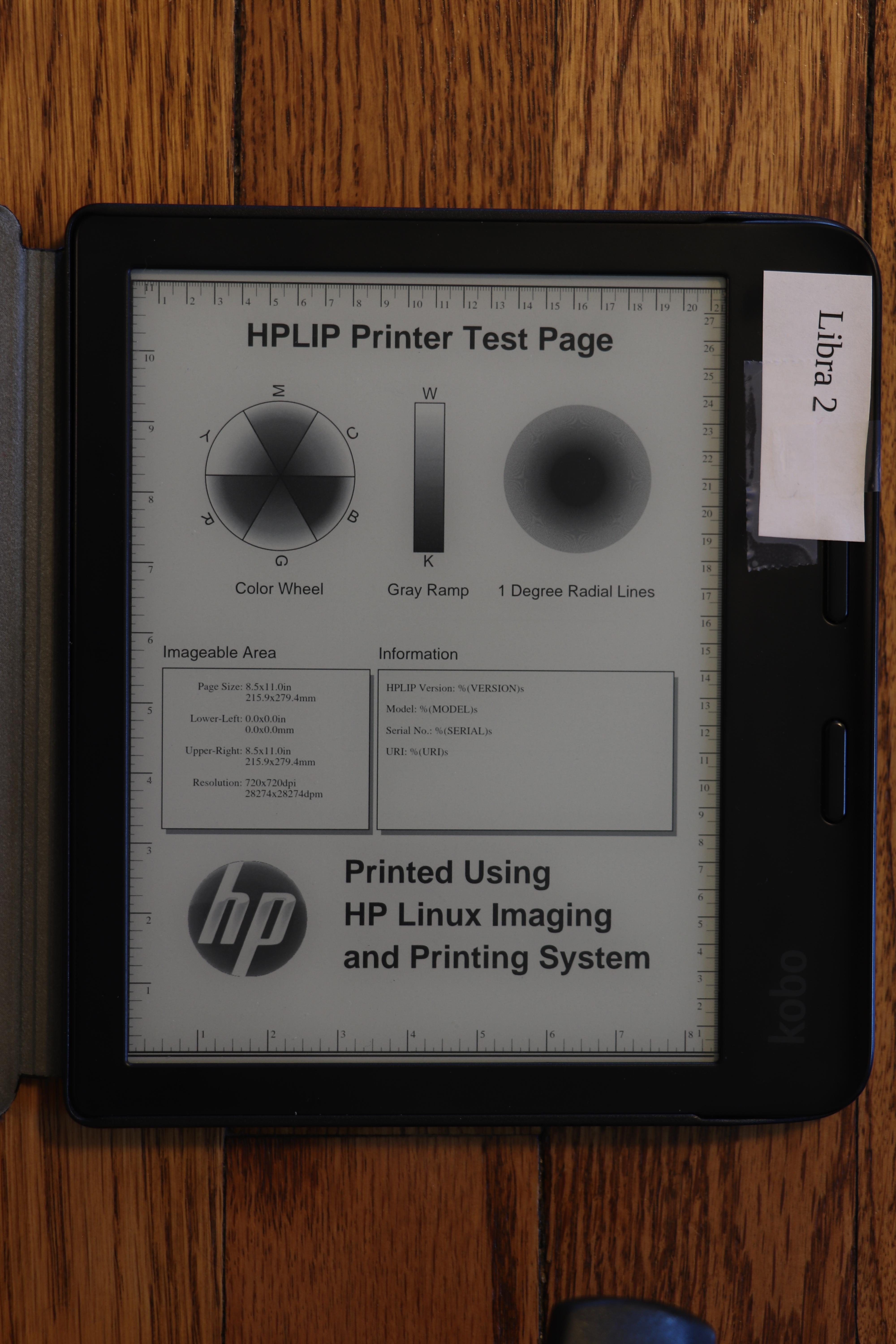
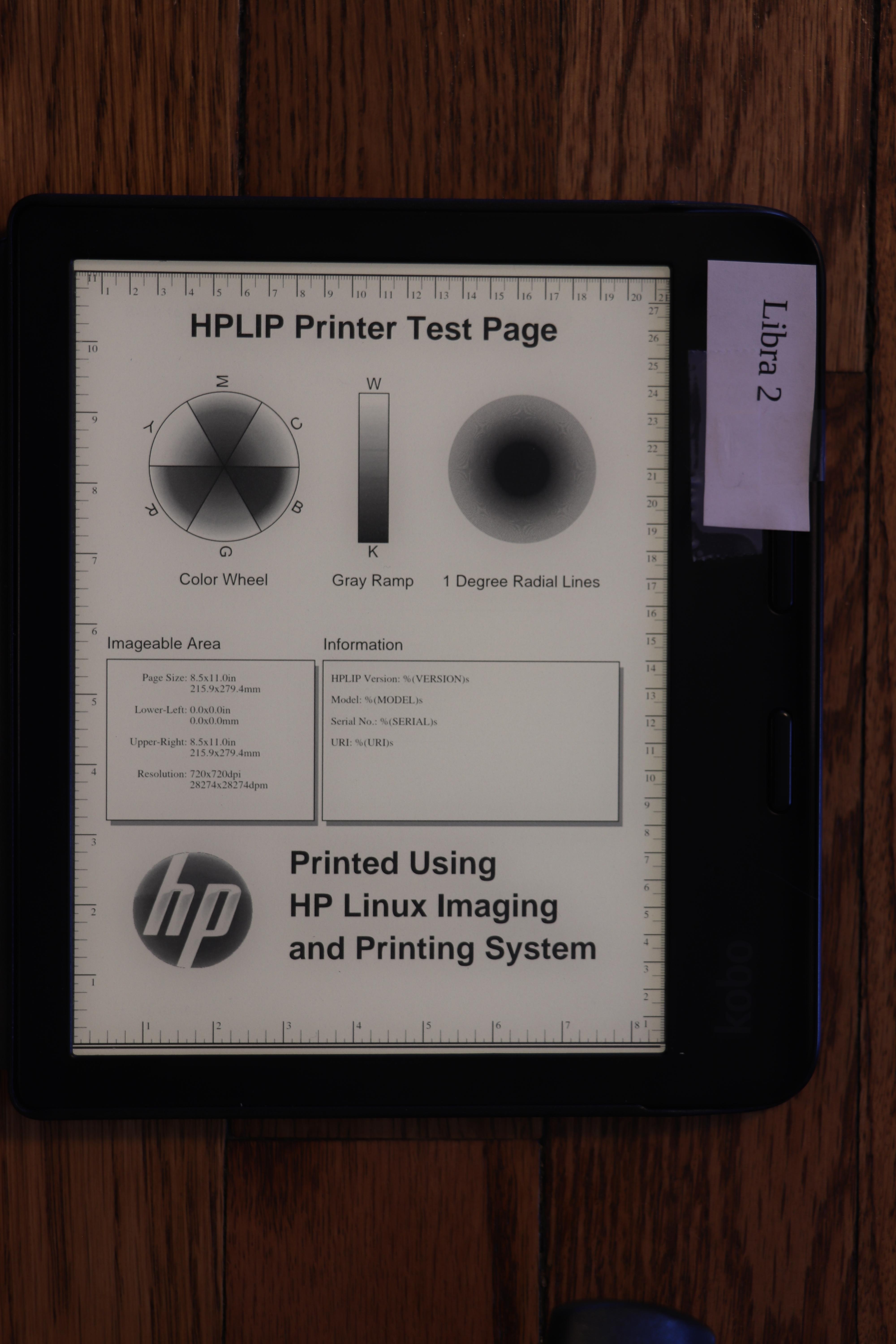
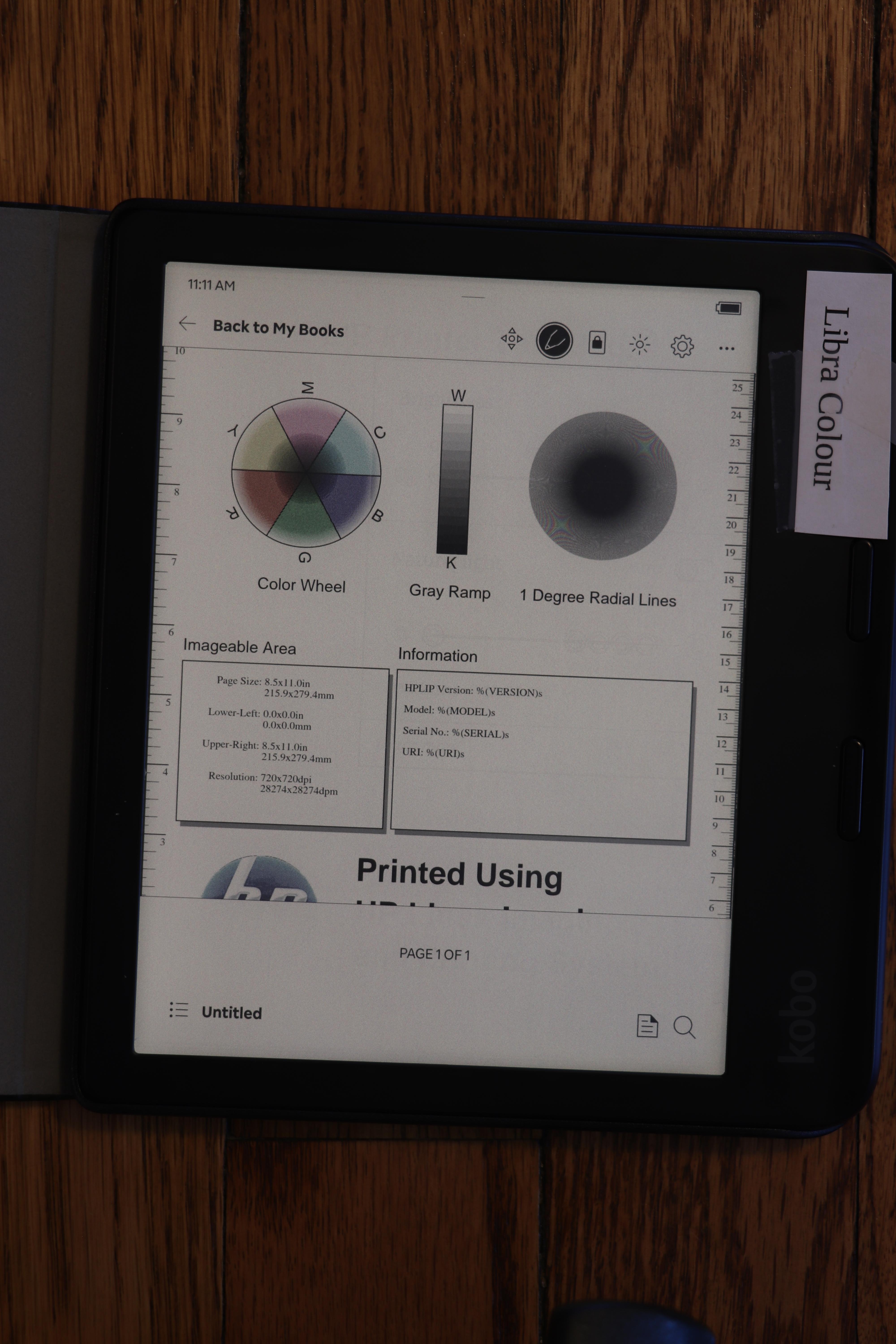
Because there has also been a lot of concern about how well fine B&W details will show up on the Kobo Libra Colour screen, I shot all photos using a PDF test image from the open source hplip package (testpage.ps.gz converted to PDF). This also rules out font differences between the devices. I ensured a full screen refresh before each shot.
This is all because color E Ink is effectively a filter called Kaleido over the B&W layer. This causes dimming and some other visual effects.
You can click on any image here to see a full-resolution view. The full-size images are the exact JPEG coming from the camera, with only two modifications: 1) metadata has been redacted for privacy reasons, and 2) some images were losslessly rotated after the shoot.
OK, onwards!
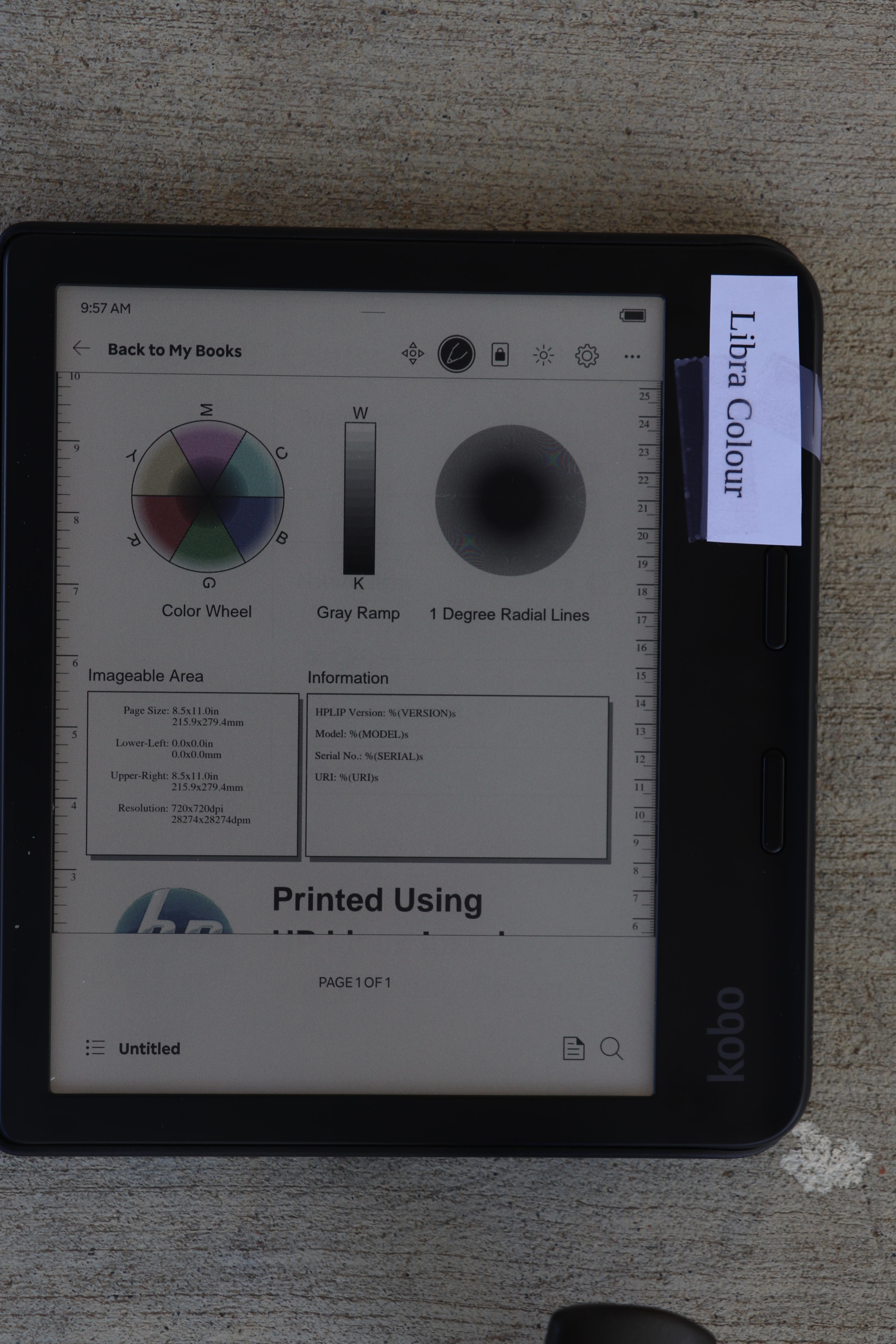
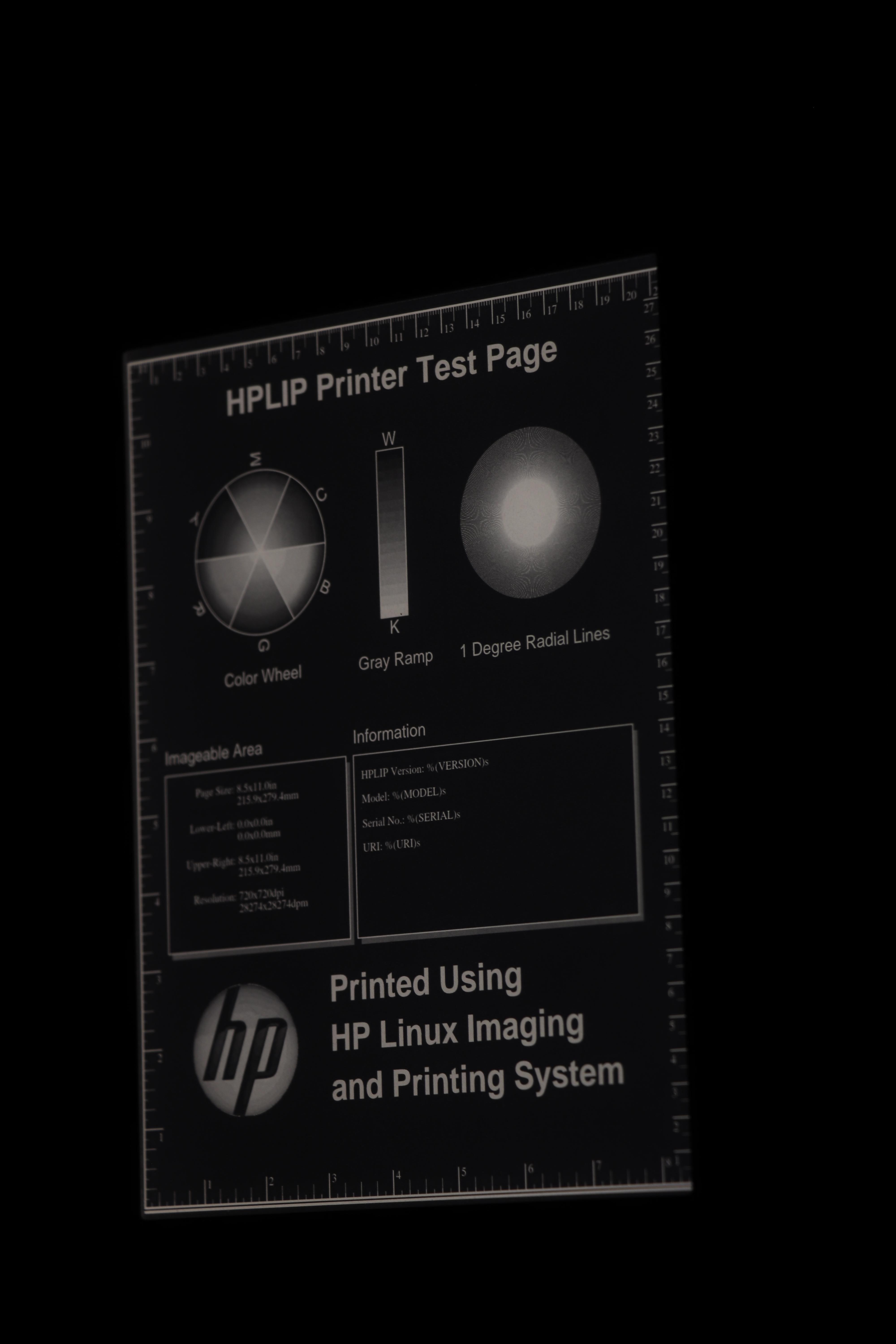
Outdoors, bright sun, shot from directly overhead
Bright sun is ideal lighting for an E Ink display. They need no lighting at all in this scenario, and in fact, if you turn on their internal display light, it will probably not be very noticeable. Of course, this is in contrast to phone LCD screens, for which bright sunlight is the worst.
Scene: Morning sunlight reaching the ereaders at an angle. The angle was sufficient so that no shadows were cast by the camera or tripod.
Device light: Off on both
Exposure: 1/160, f16, ISO 100
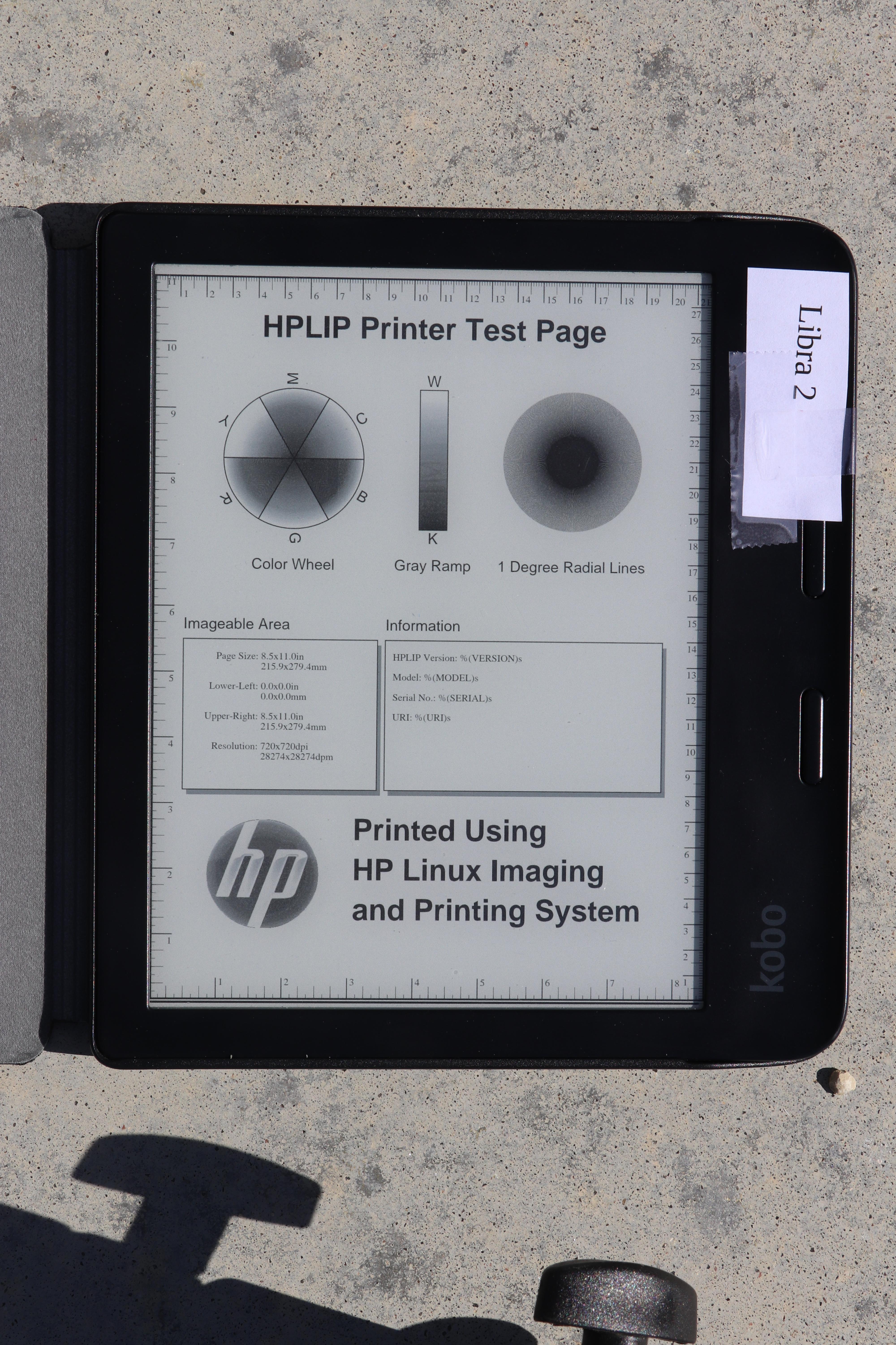
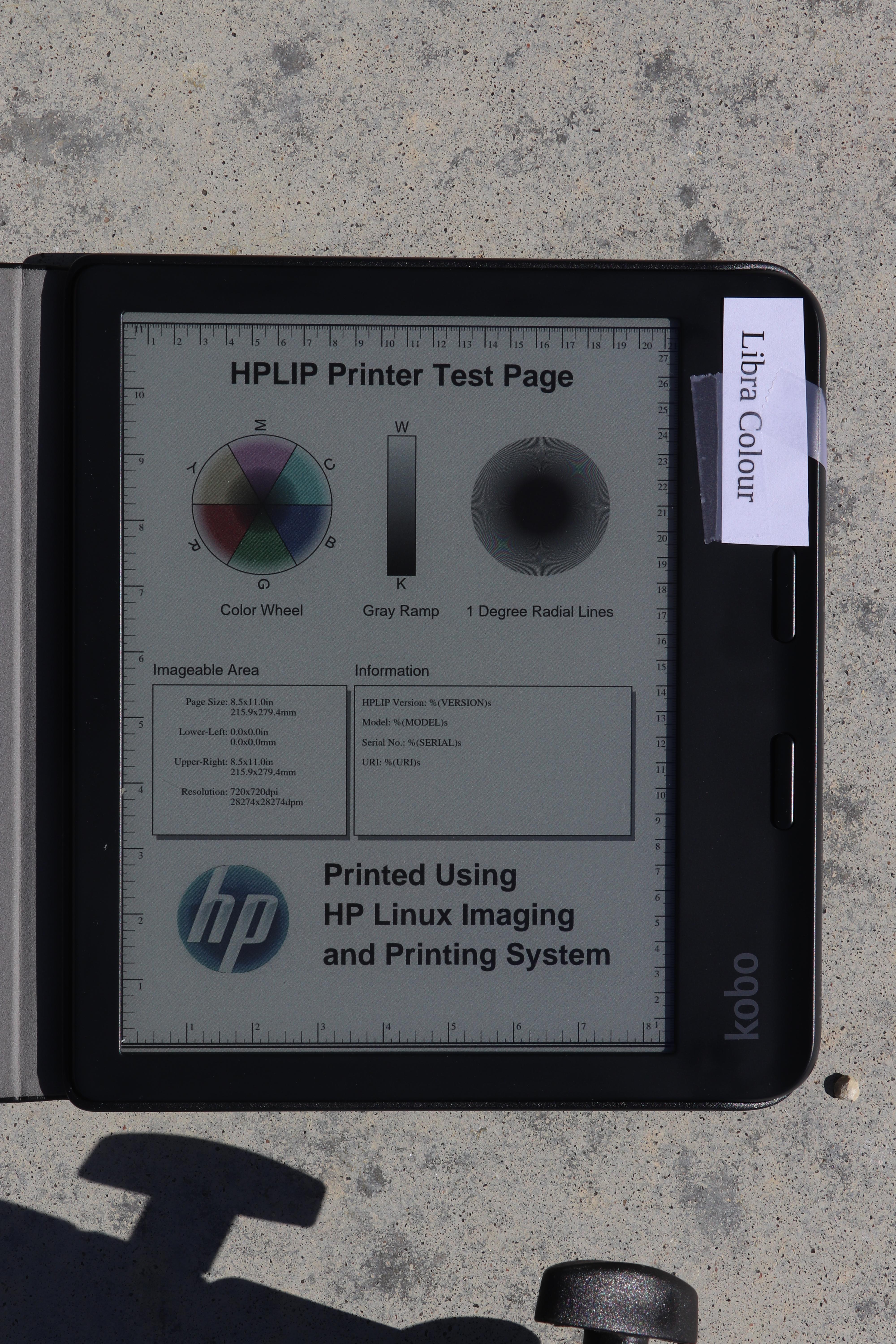
You can see how much darker the Libra Colour is here. Though in these bright conditions, it is still plenty bright. There may actually be situations in which the Libra 2 is too bright in direct sunlight, requiring a person to squint or whatnot.
Looking at the radial lines, it is a bit difficult to tell because the difference in brightness, but I don’t see a hugely obvious reduction in quality in the Libra 2. Later I have a shot where I try to match brightness, and we’ll check it out again there.
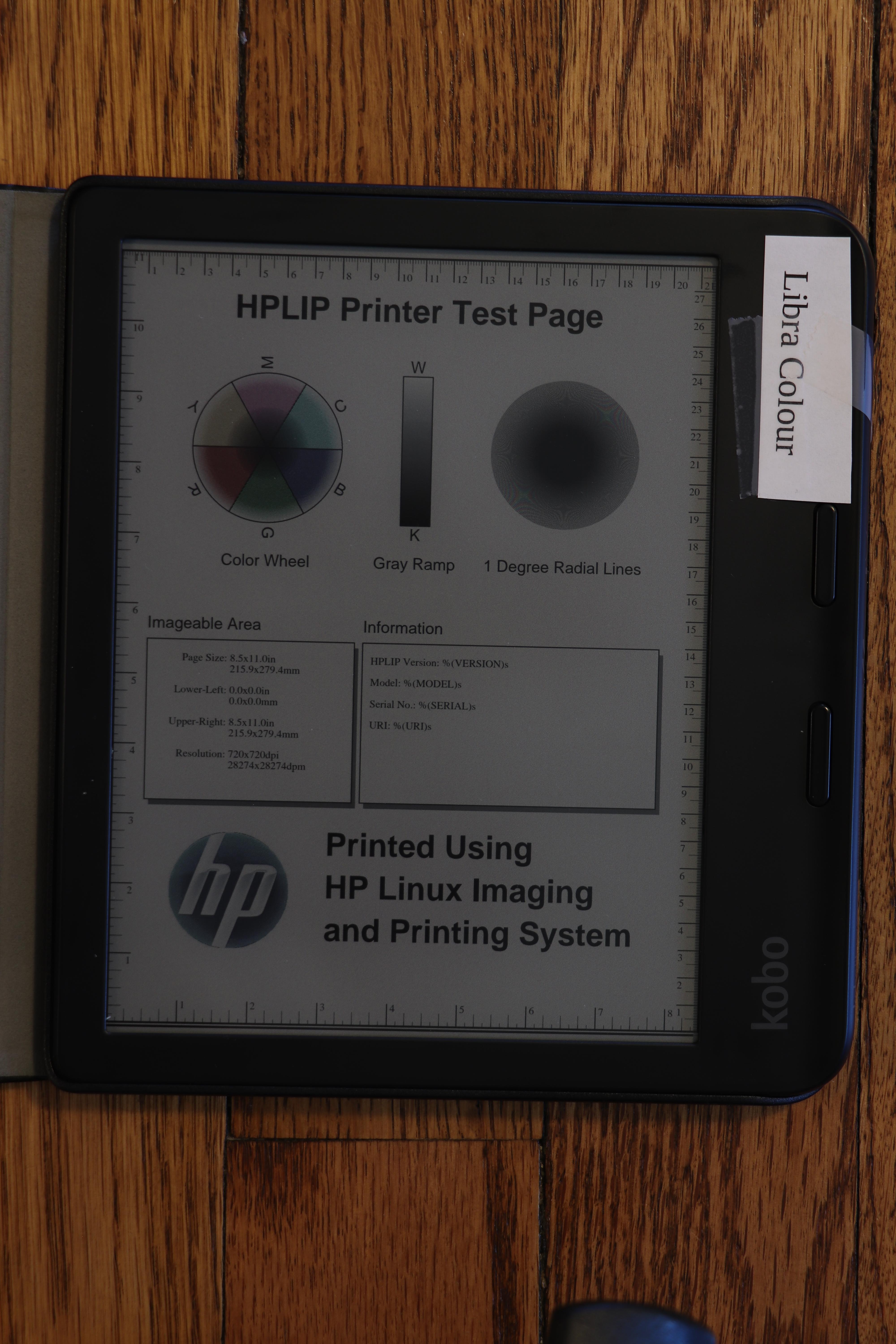
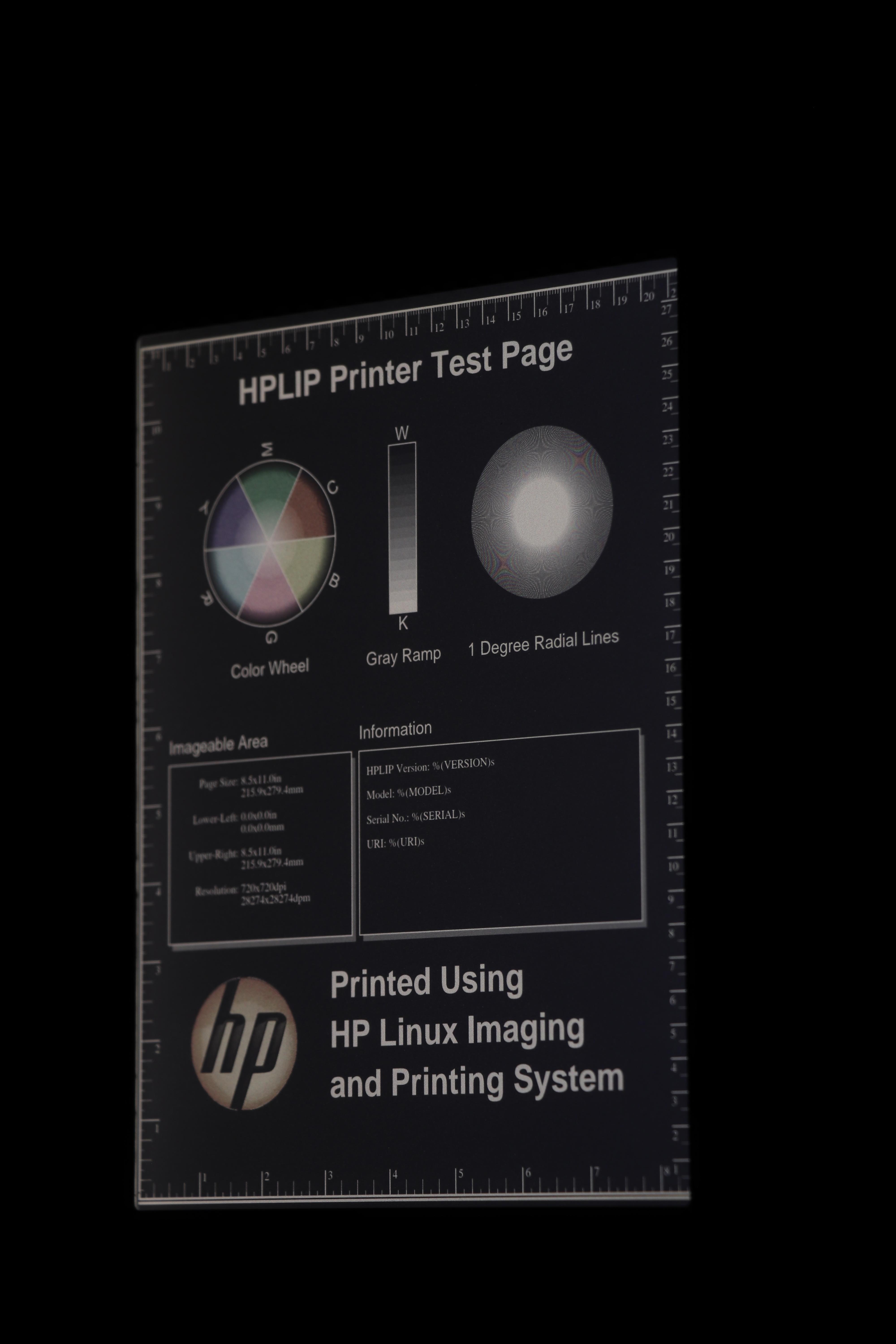
Outdoors, shade, shot from directly overhead
For the next shot, I set the ereaders in shade, but still well-lit with the diffuse sunlight from all around.
The first two have both device lights off. For the third, I set the device light on the Kobo Colour to 100%, full cool shade, to try to see how close I could get it to the Libra 2 brightness. (Sorry it looks like I forgot to close the toolbar on the Colour for this set, but it doesn’t modify the important bits of the underlying image.)
Device light: Initially off on both
Exposure: 1/60, f6.4, ISO 100
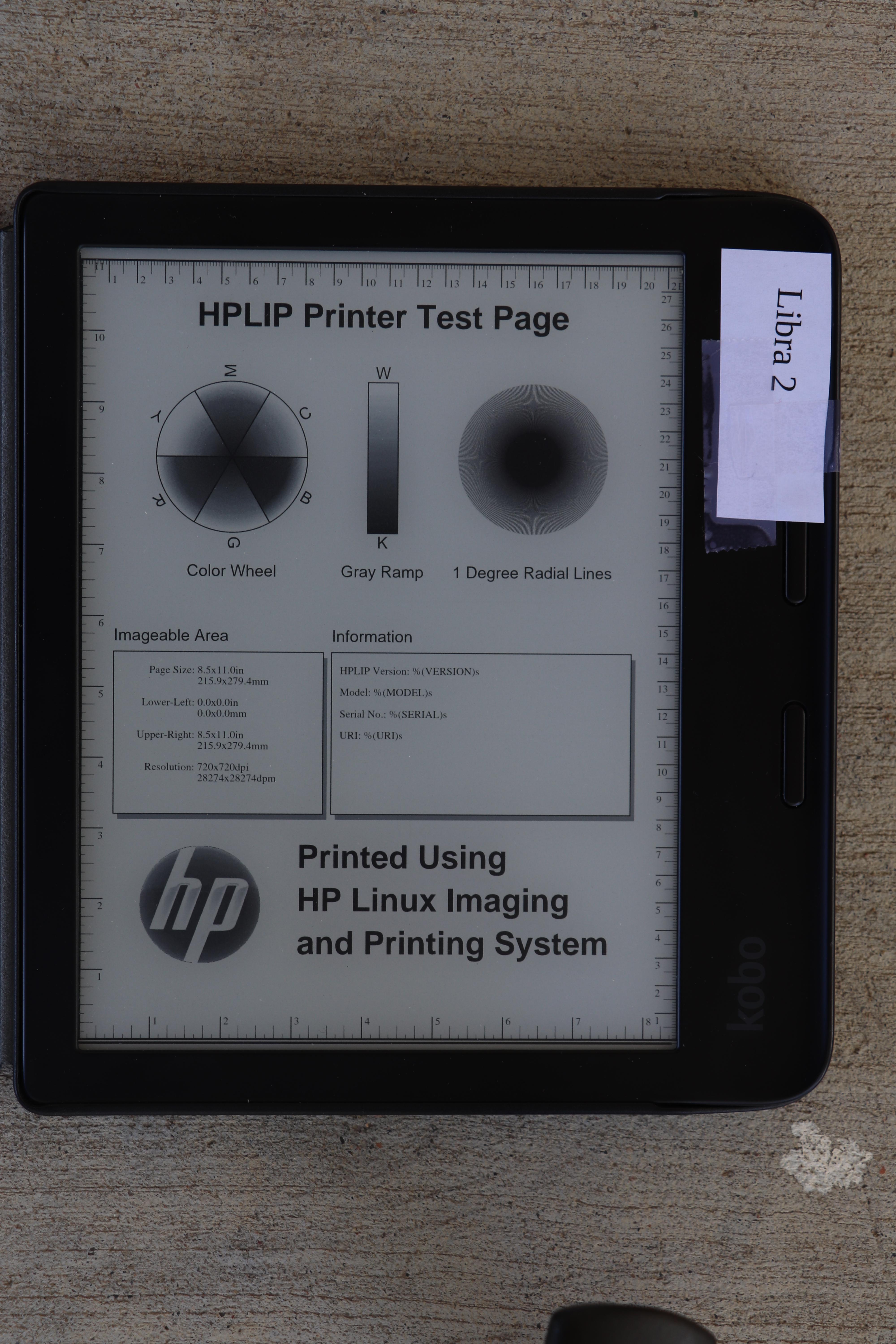
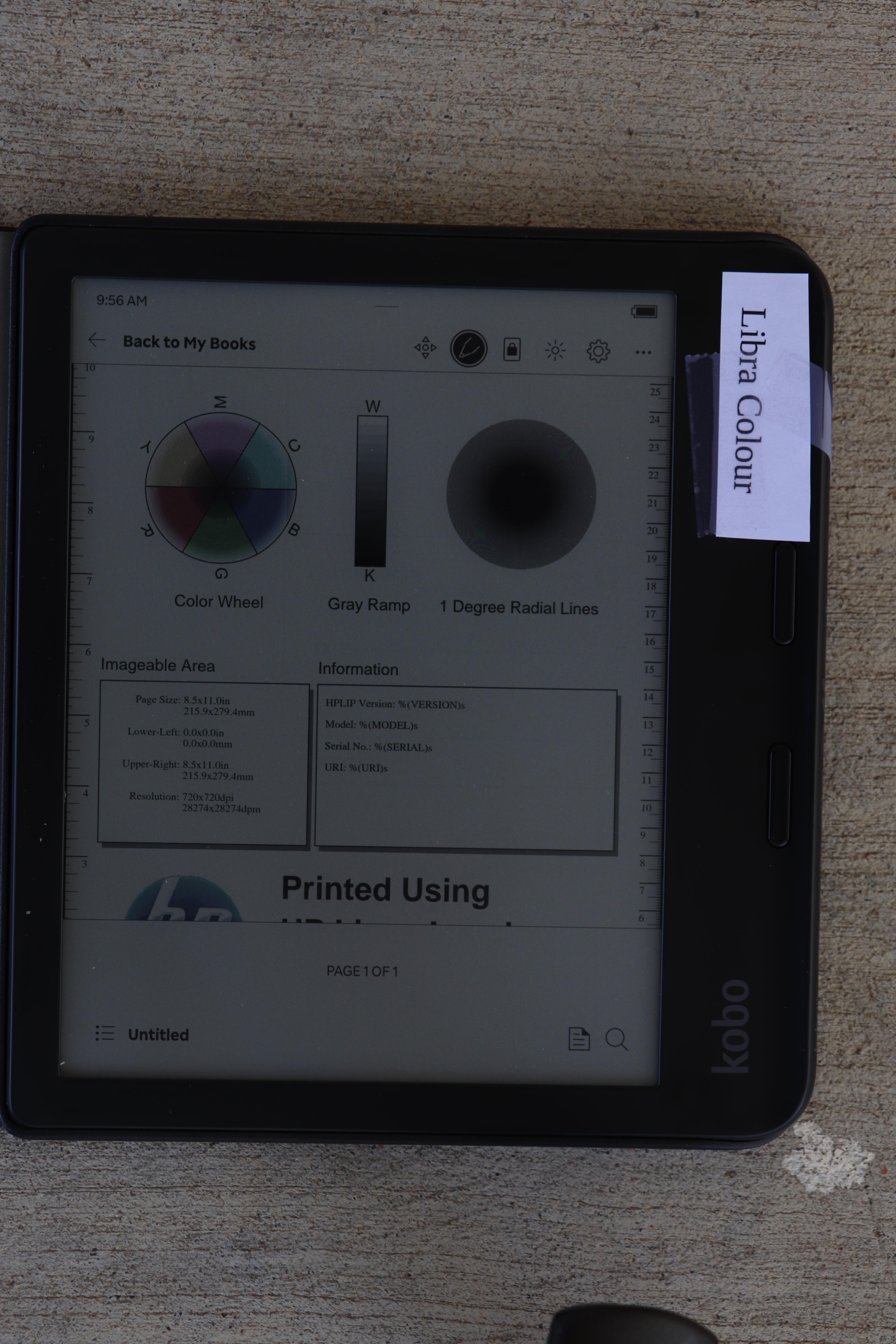
Here you can see the light on the Libra Colour was nearly able to match the brightness on the Libra 2.
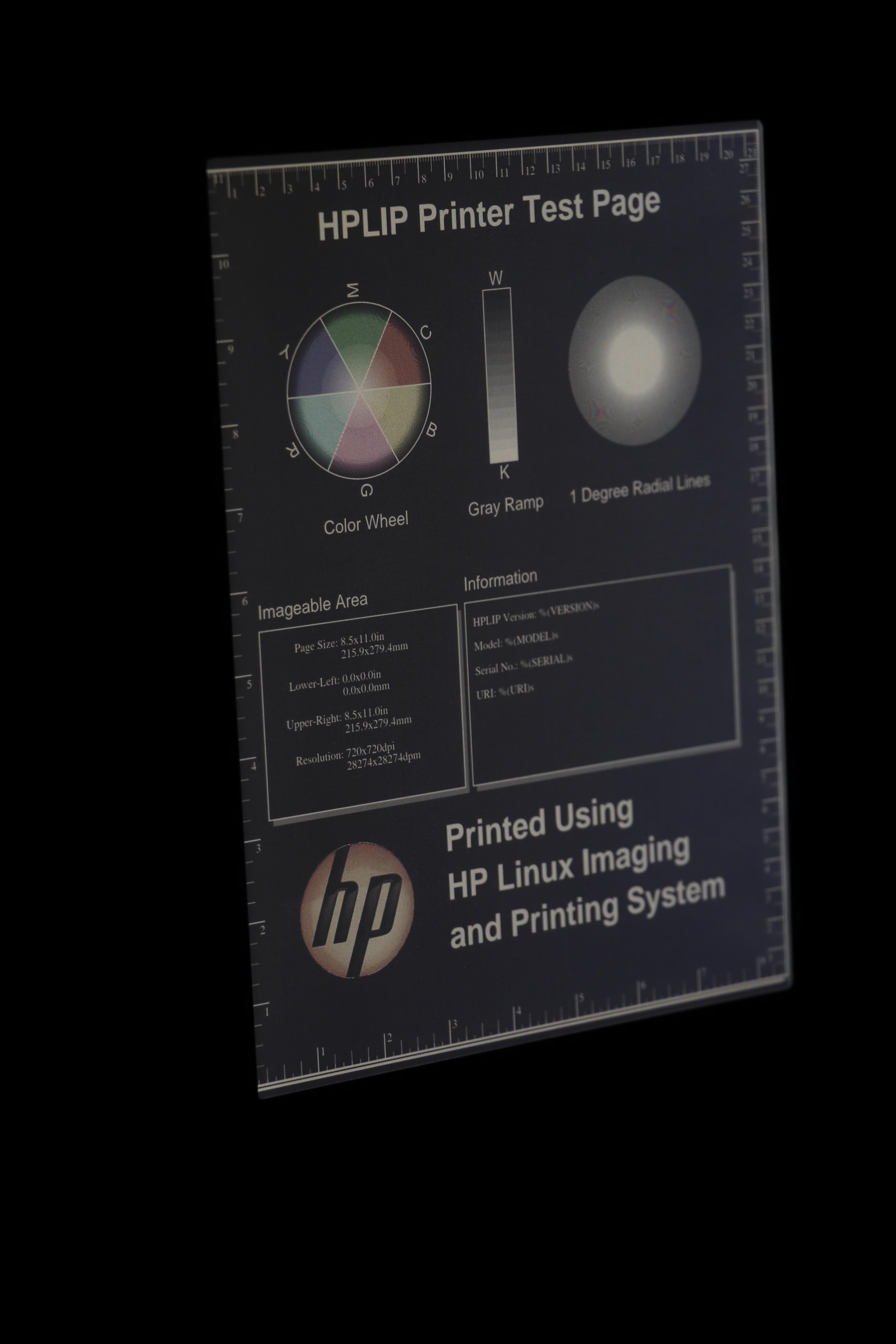
Indoors, room lit with overhead and window light, device light off
We continue to move into dimmer light with this next shot.
Device light: Off on both
Exposure: 1/4, f5, ISO 100
Indoors, room lit with overhead and window light, device light on
Now we have the first head-to-head with the device light on. I set the Libra 2 to my favorite warmth setting, found a brightness that looked good, and then tried my best to match those settings on the Libra Colour. My camera’s light meter aided in matching brightness.
Device light: On (Libra 2 at 40%, Libra Colour at 59%)
Exposure: 1/8, f5, ISO 100
(Apparently I am terrible at remembering to dismiss menus, sigh.)
Indoors, dark room, dark mode, at an angle
The Kobo Libra Colour surprised me with its dark mode. When viewed at an oblique angle, the screen gets pretty washed out. I maintained the same brightness settings here as I did above. It is much more noticeable when the brightness is set down to my preferred nighttime level (4%), or with a more significant angle.
Since you can’t see my tags, the order of the photos here will be: Libra 2 (standard orientation), Colour (standard orientation), Colour (turned around.
Device light: On (as above)
Exposure: 1/4, f5.6, ISO 100
Notice how I said I maintained the same brightness settings as before, and yet the Libra Colour looks brighter than the Libra 2 here, whereas it looked the same in the prior non-dark mode photos. Here’s why. I set the exposure of each set of shots based on camera metering. As we have seen from the light-off photos, the brightness of a white pixel is a lot less on a Libra Colour than on the Libra 2. However, it is likely that the brightness of a black pixel is about that same. Therefore, contrast on the Libra Colour is lower than on the Libra 2. The traditional shot is majority white pixels, so to make the Libra Colour brightness match that of the Libra 2, I had to crank up the brightness on the Libra Colour to compensate for the darker “white” background. With me so far?
Now with the inverted image, you can see what that does. It doesn’t just raise the brightness of the white pixels, but it also raises the brightness of the black pixels. This is expected because we didn’t raise contrast, only brightness.
Also, in the last image, you can see it is brighter to the right. Again, other conditions that are more difficult to photograph make that much more pronounced. Viewing the Libra Colour from one side (but not the other), in dark mode, with the light on, produces noticeably worse contrast on one side.
Conclusions
This isn’t a slam dunk. Let’s walk through this:
I don’t think there is any noticeable loss of detail on the Libra Colour. The radial lines appeared as well defined on it as on the Libra 2. Oddly, with the backlight, some striations were apparent in the gray gradient test, but I wouldn’t be using an E Ink device for clear photographic reproduction anyhow.
If you read mostly black and white: If you had been using a Kobo Libra Colour and were handed a Libra 2, you would go, “Wow! What an upgrade! The screen is so much brighter!” There’s little reason to get a Libra Colour. The Libra 2 might be hard to find these days, but the new Clara BW (with a 6″ instead of the 7″ screen on the Libra series) might be just the thing for you. The Libra 2 is at home in any lighting, from direct sun to pitch black, and has all the usual E Ink benefits (eg, battery life measured in weeks) and drawbacks (slower refresh rate) that we’re all used to.
If you are interested in photographic color reproduction mostly indoors: Consider a small tablet. The Libra Colour’s 4096 colors are going to appear washed out compared to what you’re used to on a LCD screen.
If you are interested in color content indoors and out: The Libra Colour might be a good fit. It could work well for things where superb color rendition isn’t essential — for instance, news stories (the Pocket integration or Calibre’s news feature could be nice there), comics, etc.
In a moderately-lit indoor room, it looks like the Libra Colour’s light can lead it to results that approach Libra 2 quality. So if most of your reading is in those conditions, perhaps the Libra Colour is right for you.
As a final aside, I wrote in this article about the Kobo devices. I switched from Kindles to Kobos a couple of years ago due to the greater openness of the Kobo devices (you can add things like Nickel Menu and KOReader to them, and they have built-in support for more useful formats), their featureset, and their cost. The top-of-the-line Kindle devices will have a screen very similar if not identical to the Libra 2, so you can very easily consider this to be a comparison between the Oasis and the Libra Colour as well.